
Customer-Driven Solution Design
Supply Chain is complicated, so customers often know what the next solution application should be before providers do. Our customers needed a business process automation and exception-based planning solution ASAP, so we facilitated design thinking workshops with them to build it.
-
Role
I was lead facilitator for the workshops, and solo designer for the solution itself.
-
Team
Co-Facilitator: Chris Burt
Developers: Sergey Gorbenko, Brad Duck, Oleg Semenchuk, David Fan, Bob Hauser
-
Date
Workshops: 2020
Design: 2020 - 2021
The Problem:
Our customers wanted to buy a solution that didn't exist.
There's a lot to keep track of in manufacturing. Often too much. Our customers' supply chain planners were spending so much time fighting fires, that they couldn't properly plan for the future. They needed a new way of working, and they needed it soon.
Most of the work done by planners was very systematic, making it ripe for automation. It was different, however, for each customer. We needed to provide a flexible process automation solution, so that each customer could solve their unique issues in their unique way.
At the same time, we needed to marry that process automation solution with a form of exception management. Our customers' planners needed a way to track big issues, and coordinate resolving them. No other supply chain solution provider had this functionality.
All new process automation AND exception management was a tall order, but doing it first was a golden opportunity we just couldn't afford to miss.

Discovery:
Most importantly, we needed to work with our customers.
Since there was nothing like this on the market when we started on it, we began with a product discovery workshop with our largest customer. I planned out the workshop, combining techniques from a variety of similar workshops I found through online research, and then facilitated them.
We organized a general knowledge share from the customer, and then went through a number of structured exercises with them meant to help align on the primary goals of the solution. We set priorities, identified the target user and their needs, and made a simple persona. Finally, we created a complete user story map, and sliced out an MVP for the solution with the customer. Afterwards, we sent them a full summary of the workshop for verification.

Completed and digitized user story map.

Digitized target user persona.

User story list.
Research:
We had some big challenges ahead of us.
We reached out to several other major customers who had also expressed interest in a solution like this one. From a series of user interviews, we took away key insights that would further guide solution design:
If automation was too hard, the entire project would fail.
To enable our customers to automate their unique processes, our tool needed to be simple in the eyes of business IT users (at least). Additionally, our tool needed to be able to handle multiple different conditions, paths, and commands to maximize flexibility.
Data was easy, but variables were the real challenge.
Hosting this new tool in the product made fetching data easy. Unfortunately, the exact data needed by each process was often highly variable. Declaring, tracking, and invoking variables in a flowcharting interface, while keepings things simple, was a tall order.
The exception dashboard had to be simple, but powerful.
Just having a great process automation tool wouldn't be enough, though. We also needed to design a powerful dashboard for identifying, managing, and resolving exceptions. To win over planners, this dashboard experience would need to be better than all our existing dashboards.
Comparing resolutions needed a serious overhaul.
A key piece of this new solution was system-suggested resolutions to exceptions. In order to commit a resolution, planners would need to be able to compare both suggested and manually created solutions with ease. Our current tools for that were out of date and needed serious improvement.
Early on in the project, it was decided that our process automation tool would be based on Cammunda's BPMN engine.
My initial mocks focused on the overall structure of the experience. The goal was bring Cammunda's flowcharts more in line with our design language, and to create an authoring panel for variables, data, settings, etc. I decided to leverage some of the patterns I’d built in the past for visualization creation.

I explored multiple options for authoring panel form factors.

I updated the visuals of the flowchart to make it clearer and more interactive.

I created an authoring toolbar for processes and future resources built in our new web client.
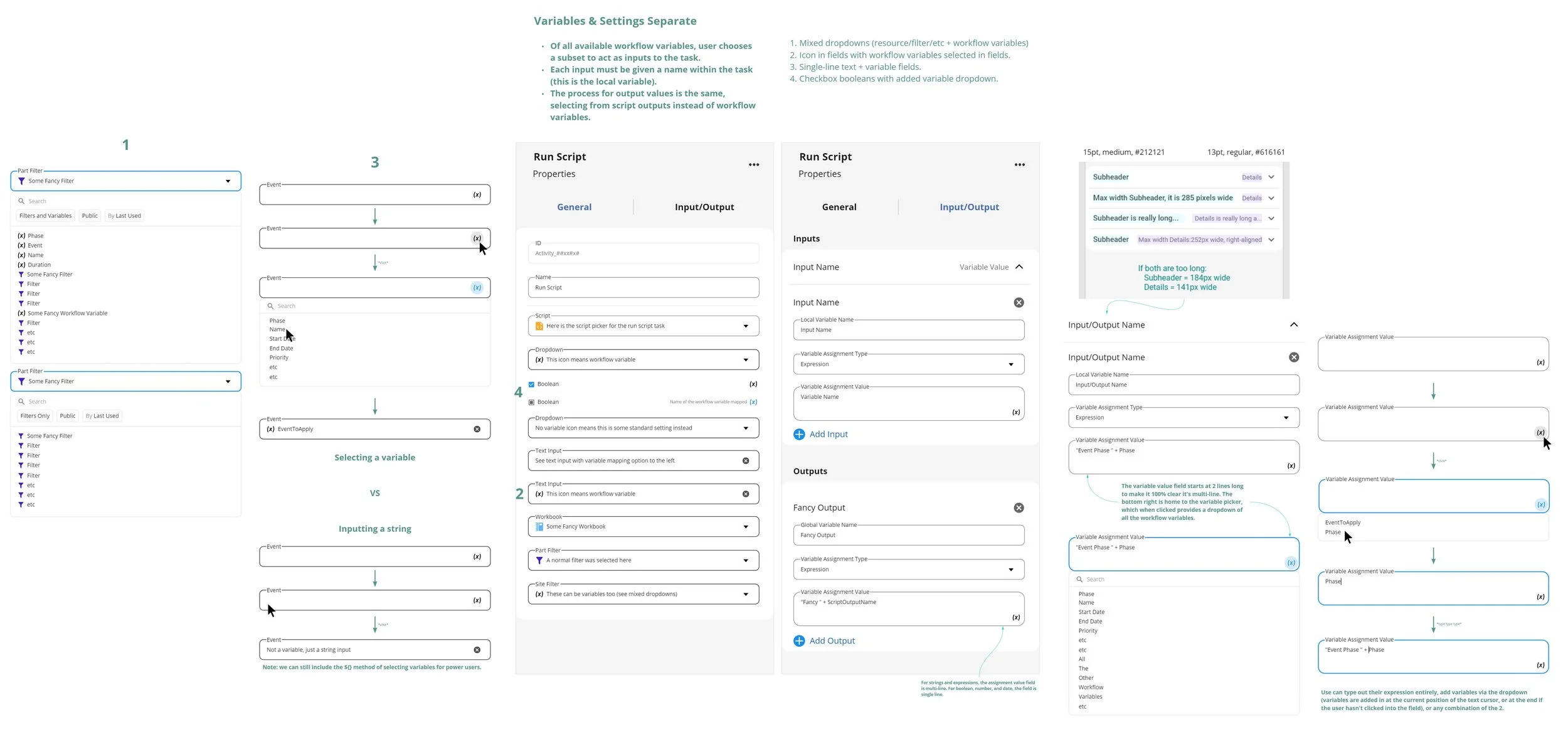
I experimented with multiple approaches to variable data and settings.
Variables appended directly to their associated settings.

After initial variable design exploration, it seemed like the simplest way to present variables was in the properties panel alongside their associated settings. I gathered all the various form controls we used for our data settings, and added variable controls to them - with an eye towards consistency and discoverability. In so doing, I even ended up discovering several inconsistencies within the controls we already had, and helped the design system team correct them.
At the Same Time:
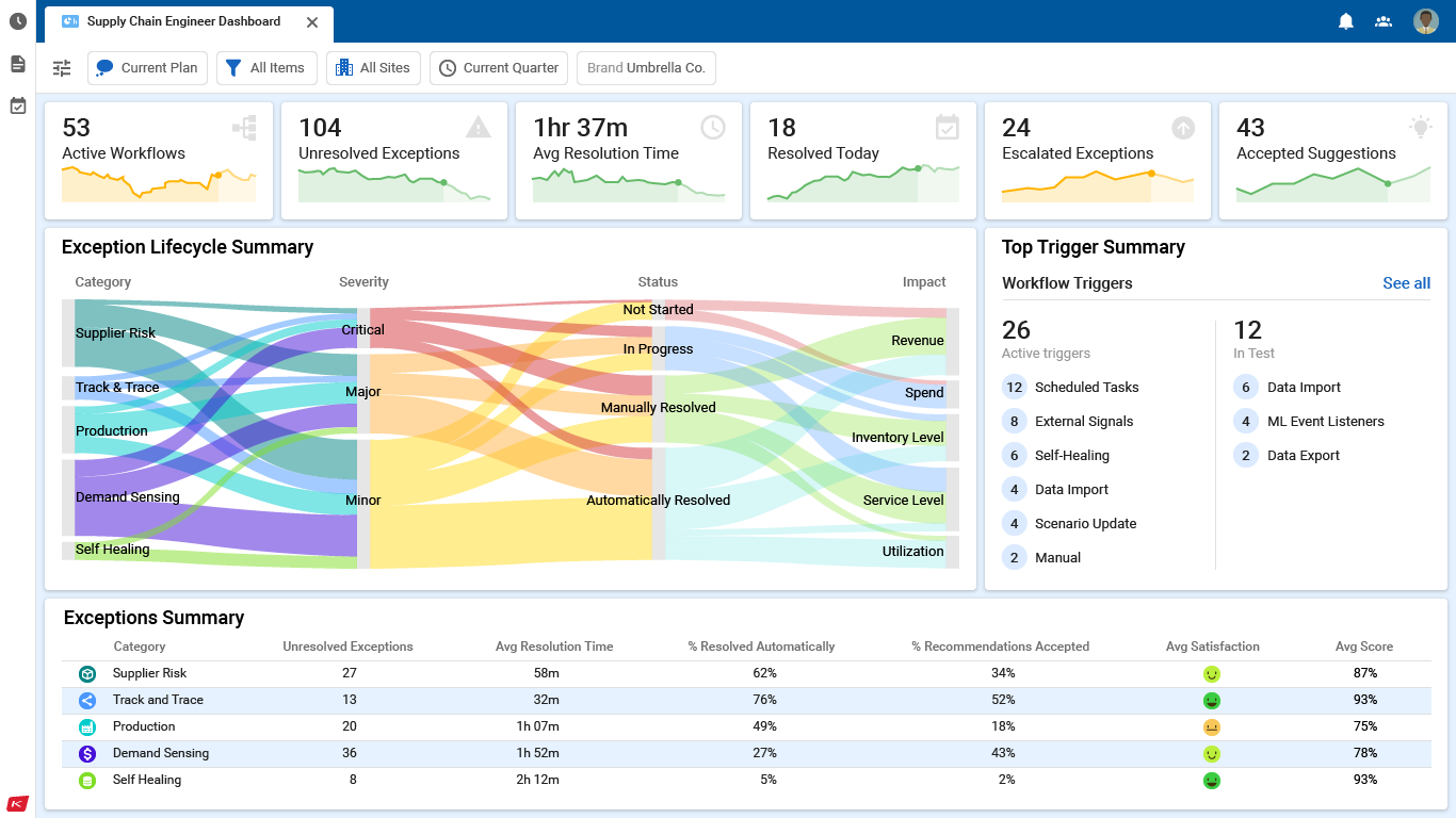
I was building a dashboard based on the workshop.
In the workshop, we learned that while individual planners were rarely responsible for products on a global scale, the decisions they made could still affect global corporate metrics. Small sparkline charts would keep those metrics top of mind, without consuming the entire dashboard. We didn’t have those in the product, so designing those was the first step. After that, we reviewed all the requirements for exception objects generated by the workshop, and used them to guide designs for both the remaining pieces in the exception dashboard, as well as an exception details view.
Our dashboards had been missing charts like these for ages.

At this point, we’d been including mocks of single value and sparkline charts in demo dashboards for probably several years. We leveraged those mocks for some quick user validation, and then I moved right into final designs. Since each represented a single metric, different customers might want more or fewer charts along the tops of their dashboards. So, I focused my design efforts on keeping the charts looking proportional regardless of size. I also tried to keep them very simple, including supplementary information only on hover. All of that worked well, and we closed the same gap across multiple solutions all at once.

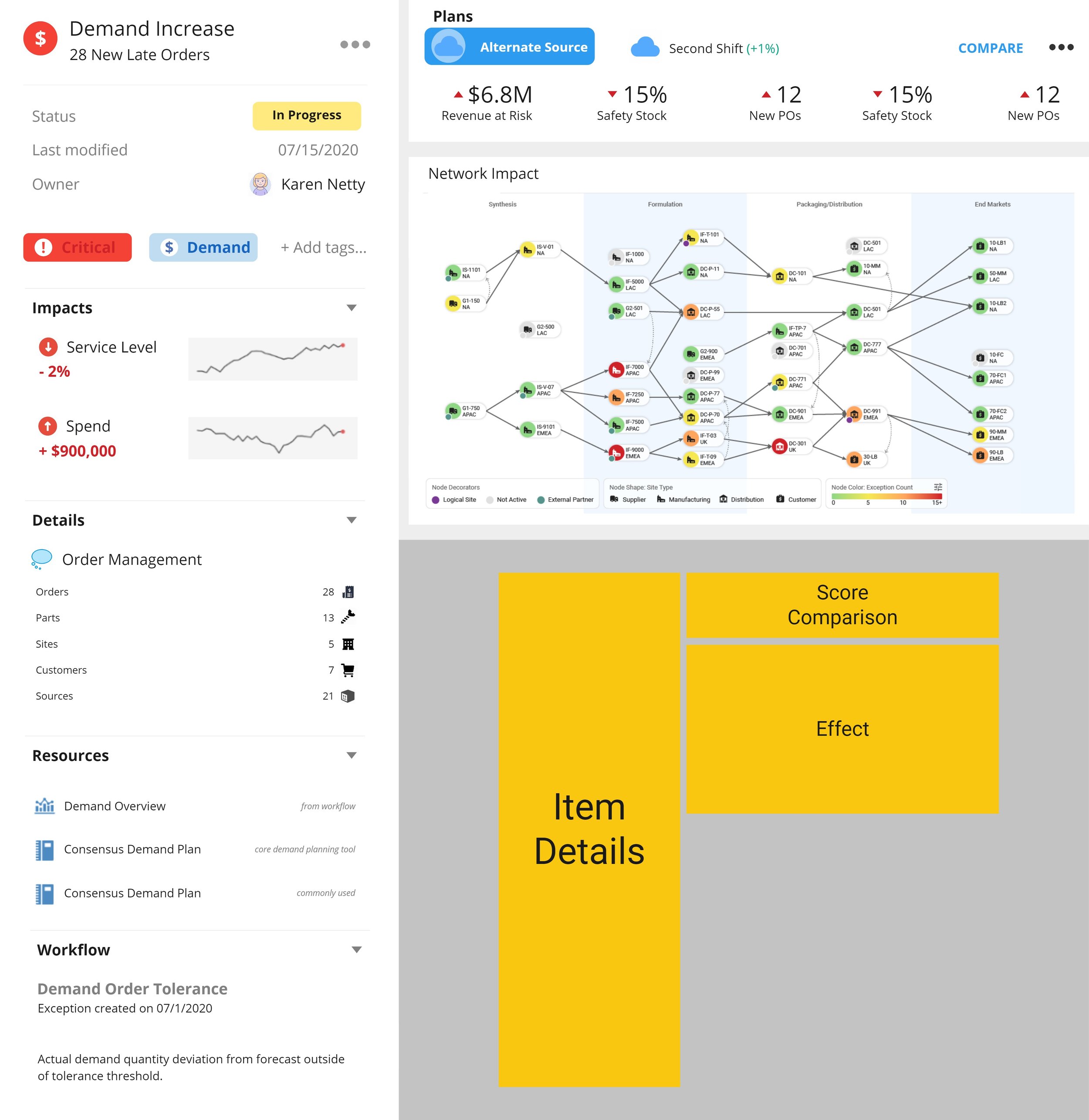
To properly investigate and resolve exceptions, planners needed both a central dashboard showing a summary of all their exceptions, and a detail page showing all pertinent information for a single exception.
We needed to show how an exception’s consequences would cascade through the business, and a way to compare potential resolutions - all at once. Our team was already working on a design for a full screen, standalone scorecard report, so I simplified that design to fit it alongside everything else planners needed for this use-case.
Testing:
And then it turned out that one of our key features just wasn't useable.
The exception dashboard and comparison tools were going over great during user testing. Same for the new flowcharts in the process automation tool. Unfortunately, the UI for assigning variables to data and settings during process automation was seriously confusing users. Only 1 of 5 users tested found workflow variables intuitive. The assumption behind that design was that both variables and the settings they replaced should be side-by-side in the properties panel. That assumption was wrong, so I went back to the drawing board, keeping in mind:
Making variables worked, using them didn't.
From the start, I'd moved declaring variables to its own tab in the properties panel, separate from data and settings. Most users were expecting to assign variables in the same place they were declaring them.
Of course, most users expecting to assign variables where they declared didn't mean all users were expecting that. My current design was working fine for some users. Just not the majority. In short, we needed multiple places in the UI where users could assign variables.
Variables fit into the flow at multiple points.
Once assigned, variables were shown in place of the data and settings they were assigned to. This was making the settings look too complicated and busy. Variable assignment needed to be presented in a way that would simplify the UI instead.
Presentation needed a serious overhaul.
The current conception of variables allowed them to replace signle settings. Our users needed variables that could do more. I went back to product management and development with this insight, and that feature was added to the backlog.
Variables needed to be more powerful.
Process automation was too technical, and it was risking the project. So I tried a new approach.
Here’s what I came out with:

In the final version, I kept variables and settings in the same tab of the properties panel, but separated them. I put a list control for mapping settings to variable at the top of the tab, and simply hid the standard controls for any settings that got replaced by variables. This meant a massively simpler UI, as well as a quick summary of all your variables in use. It required a 2-step dropdown, but more than made up for it.


The final version of the dashboard was also more streamlined. It showcased KPIs, and then summarized exceptions from a variety of perspectives.
The final details view put a bit more emphasis on the scorecard comparing solutions.

Conclusion:
After a final round of testing, we knew we had a solution that worked.
With the new variable design, 9 of the 10 users tested found variables intuitive. A far cry from 1 of 5, that’s for sure!
Additionally, I learned that ‘keeping a design consistent’ could mean several things. My early designs were focused around enhancing our existing UI controls as much as possible. However, in an attempt to be as consistent as possible with our existing design system, the internal consistency of the experience had suffered greatly.
After all, while reuse is one of the major virtues of design systems, sometimes you need to build on top of them to deliver the right experience. Now, with each new project I take on, I always take time to consider whether to leverage or extend the design system.