
Bia Power EV Charging Dashboard
A customer-facing dashboard was never part of Bia's roadmap. At least not until users got their hands on an internal troubleshooting dashboard and loved it. Bia spruced up what they had and quickly released it as part of their product. But they needed a formal research and design cycle.

-
Role
I was lead for this project. I created all the research material and reports, lead initial designs, built the prototype, and created the testing material and reports. The final designs and design system were split between myself and another designer.
-
Team
Co-Designer: Nancy Xu
PMs: Ian Sugiura, Roby Moyano
Developer: Jose Luis Espada Almansa.
-
Date
May 2023 - July 2023
Additional Work done in August 2023
The Problem:
Bia's dashboard never went through a proper design cycle.
Bia provides software for smart electric vehicle (EV) charge management, but their dashboard was never designed for its customers. Initially, Bia's offering was purely an optimization and simulation tool. However, Bia used an internal dashboard to troubleshoot customer systems.
Only after enough customers were exposed to the dashboard and began requesting access did Bia begin to offer business intelligence for EV charging as well. The process for adapting that internal dashboard for customer use, however, wasn't ideal. The resulting design looked alright, but wasn't supported by user research and testing.
My co-designer and I were hired to redesign key screens, complete with a full research and testing cycle.
Bia’s Original Dashboard Design
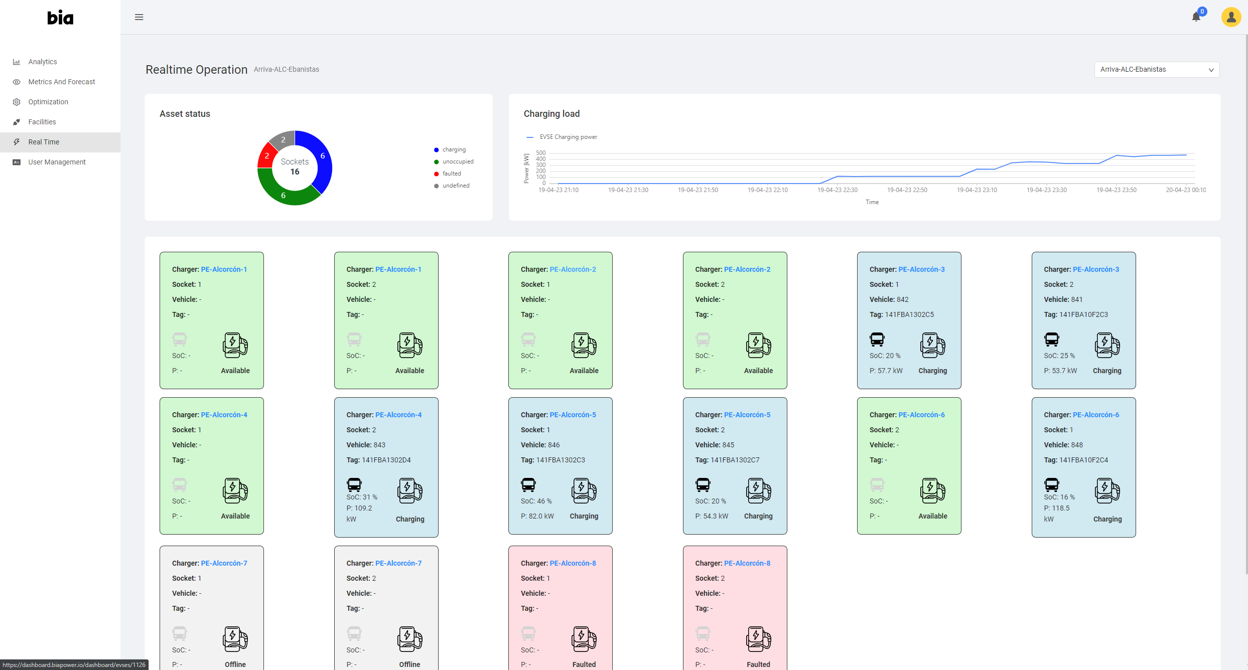
The most-used tab on Bia’s dashboard was the Real Time tab, which displayed the status of EV chargers.
Bia was leveraging an external design system for their charts, but had built their charger cards from scratch.
They knew the charger cards didn’t look great, but weren’t sure if there were other issues.

The other most-used tab was the Metrics tab, which showed facility-level KPIs over a selectable date range.
Bia liked the look of this tab, but didn’t feel confident they were showing the most valuable data.
The charger cards only showed a small slice of the total data available. Everything else was behind a double-click drill-to-details action on each card.


In order to determine how to best serve Bia's customers, I created a remote interview script. Our target was 5 customer interviews, each 1 hour in length. The goals of the interviews included:
Learning how the dashboard fit into users' existing workflows.
Determining what value the dashboard was currently delivering to users.
Identifying shortcomings preventing users from gathering key insights or performing key tasks.
Gathering suggestions and feature requests to review with the larger team.
We met our interview targets and emerged with a wealth of data and context to help guide our designs moving forward. I analyzed the interview findings, created a report summarizing key insights and feature requests, and presented it to the team.
You can download the full report here.
User Research:
We needed to know how we could deliver the most possible value.

The Bia team had a shortlist of issues they suspected would come up during research.
While all these issues were mentioned, they definitely weren’t the main issues users had with the dashboard.
More than anything else, users wanted to talk about what data was being shown. This led to many feature requests for us to review with the team.
With the help of Bia’s executive team, the product team prioritized these feature requests, and decided which ones would appear in the new design.
Insights:
The RealTime tab needed a design overhaul.
The information present on the RealTime tab was helpful, but difficult to consume. A lot of the most useful information was buried, so we needed to make it more prevalent. Filtering through the data was also difficult. There were many potential ways to filter the dashboard, so we asked users which they'd find most useful.
Drill to details screens were overloaded.
One of the primary actions in the main tab was drilling to details on an individual EV charger. We asked users both about the interaction to drill to details, and the resulting screen. What we learned was that the interaction wasn't immediately obvious, and that the resulting screen was unfocused and cluttered.
Interactions & navigation needed more consistency.
While changing tabs on the dashboard was simple, other forms of navigation were very inconsistent across the experience. Use of modals wasn’t systematic. Filtering was different on each tab. Overflow menus for components were all in different places, and visualizations didn't share all the same zooming/filtering features.
Users really wanted a table view.
The previous design for the main tab represented EV chargers as a grid of cards. While users with smaller fleets of chargers were perfectly happy with that view, users with large fleets of chargers stressed the incredible importance of a list/table view instead. Data density needed to improve. That was essential.
The major metrics needed re-evaluation.
Another tab dedicated to monitoring metrics had the 2nd most traffic, so we spoke to users about this tab as well. The biggest issue was with the metrics themselves: there were several users identified as either unimportant or confusing. Otherwise, feedback on the metrics tab was positive, so we decided to focus on RealTime.
Key information was missing in the charger summaries.
Lastly, we spoke to users about what information was missing from the dashboard - they gave us a lot of answers, and we worked with Dev and PM to identify what was technically feasible, and of that, what we would include in the design. Bia’s CEO joined in on this discussion to help prioritize the many feature requests received.

There was also a lot of positive feedback. We took note of which features users spoke the most highly of, and suggested raising those features out of obscurity to make the value they provided more accessible.

It turned out that not only did the charger cards look rough, they also weren’t showing what users wanted to see.
Nailing the new charger card design became the top priority of the project.
Slide from the research report.
A feature request that came up time and time again was a list or table view of the chargers in the Real Time tab.
Most users interviewed managed facilities with large numbers of chargers. They wanted something more compact than the card grid.

Initial Designs:
We focused our initial explorations on improving the charger cards.
Following multiple discussions of the report with the larger team as well as Bia executives, we decided which feature requests to include in the new designs. We also prioritized insights and user issues to help guide our focus in creating the new design.
We then reviewed designs from other EV charging apps, and gathered more general inspiration for components, styles, etc to help supplement the design and branding system provided to us by Bia.
Early mocks were built in MIRO, with several cycles of presentation and refinement.


We didn’t entirely stop exploring options, however, until after another round of presentation and iteration.
Users wanted a lot of data, but often also mentioned clutter on the Real Time tab as a problem, so we did everything we could to strike a balance.
Information hierarchy and filtering were very lacking in the original dashboard design.
So we added a summary widget at the top that doubled as a filter on the most commonly requested criterion: charger status.
We changed the within-tab navigation paradigm to rely entirely on simple ellipsis menus. Our hope was that providing multiple drill-to-details targets from a single menu would make those interactions easier to discover and use.

We experimented with multiple card designs, showing key data requested by users in both differing orders and amounts of detail.

We designed the new table view for users with a lot of data to sift through.
As such, we tried to keep it barebones, but with the ability to expand rows to see more data about items of interest.
We wanted our table to have much more data density than the card grid, but not get so crowded that it became difficult to scan.

After presenting our initial concepts to the Bia team and receiving great feedback, our charger card designs began to converge.
We began working on table row designs partitioned to match the card info.
Testing Prototype
Once we’d landed on a new design direction, it was time to put together a simple prototype for testing. I drafted the test script, finalized it with the team, and built the prototype to match it. We went for an open prototype focused on exploration, rather than a linear prototype meant to capture a single flow.
I’ve embedded the prototype below, but if that doesn’t work for whatever reason, you can view it within Figma here.
Testing Insights:
Users loved the new designs, but some minor revisions were needed.
The main tab redesign was very successful.
The new charger card designs went over very well. Users approved of the new information hierarchy, and loved the new data we added. The new look was also positively received. Also, the new filtering paradigm went over well, with every filtering task seeing a success rate of 80 to 100%. Already, that was a huge win!
Interactions and navigation were much easier to use.
Putting drill-to-details behind ellipsis menus went over very well and did exactly what we'd hoped. Users were able to find all these navigation options easily, and several mentioned having them named in a menu was much clearer. Always having ellipsis menus in the top-right of elements also received positive feedback.
The updated major metrics were the most essential.
Users were very pleased with the updated set of metrics. There was unanimous agreement that nothing was missing and nothing was superfluous. One user voiced a desire to be able to see more about how metrics were calculated, so we made a note to add that as a form of help in the next design iteration.
Users loved the new table view.
Navigating to table view and finding data within the table were very easy tasks. Users also praised the table for its data density. While row expansion wasn't immediately obvious to all users (40% needed help spotting it), all users liked the idea. We decided to keep it in, but made notes to make it more discoverable in the next iteration.
There were a few minor mistakes we needed to clean up.
The feature that performed the worst was a new sorting feature we had included to supplement filtering. While it was easy for users to find the dialog, they struggled with the drag-and-drop sort interaction. Future iterations only really needed minor tweaks. Almost everything tested very well.

Exactly 50% of test questions had perfect scores, and 75% of test questions scored 4/5 or higher. In general, the new designs tested very well.
Since we’d focused on the Real Time tab, however, the more negative feedback was mostly in response to the Metrics tab.
We suspected that might be the case, and so I wrote the test script to further probe into feedback on the Metrics tab with follow-up questions.
As a result, we emerged from testing with a strong idea of what we needed to do to make the Metrics tab every bit as great as the new Real Time tab.
I included performance summaries by user as well as by task.
Only 1 user scored below 13/16.
We suggested that it might be worth testing additional users within a similar demographic to see if there was a pattern.
Unfortunately, the project was swiftly approaching its deadline, so Bia decided not to pursue this line of inquiry further.
The tests confirmed that the new design had resolved all the issues the Bia team had identified prior to research.
The tests also confirmed that we’d hit the mark on including the right data for users to get the most value out of the Real Time tab.
Our primary focus so far, the Real Time tab, tested very positively in almost every respect.
The only issues were with a supplementary dialog, and a new table feature.

The worst-performing task in the entire test was focused around sorting.
We’d included a modal dialog for sorting the charger cards/table, and tried out a drag-and-drop list where users could simply order the columns in the sort order they preferred.
While the interaction was simple, users struggled with the concept overall.
In the next design iteration, we just used combo-boxes instead. Maybe a bit boring, but definitely easier to understand.


Final Designs:
Our final product after a complete research and testing cycle.
After testing, we made our revisions and presented a set of hi-fi designs to the team. We came out of that presentation with a final round of feedback to integrate into the final product. It’s also at this stage that we further integrated Bia’s branding into the designs, and provided some updated designs for the drill-to-details screens.
We knew from our research that the content of the drill-to-details screens was solid, it was only finding the screens that was hard - and we knew from testing that we’d already solved that issue.
Our final design for the Real Time tab added branding colors, labels on the grid/list view buttons to enhance discoverability, more color-coding on charger cards, and a few other details.

We kept changes to the table relatively subtle, with the largest being an addition of a info tooltip to help users learn how to use the table’s features.


We used those same KPIs cards again in one of the drill-to-details modals from the Real Time tab. That way, users could see their KPIs for their whole facility from the Metrics tab, but see the same KPIs for an individual charger from the Real Time tab.
We also updated the Metrics tab following testing feedback, providing an improved set of KPIs and an info tooltip on each and every widget so users could see how the KPI is calculated and learn what data was being used to make that calculation.


We also cleaned up the drill-to-details screen for an individual charging session, fitting in a few more KPIs requested during the research phase.
Design System:
We left Bia with the tools to further iterate on and scale our designs.
The Bia team and executives were very happy with the final designs, so we moved on to the last stage of our contract: turning our final product into a scalable design system.
We built the system up from the fundamentals, starting by specifying colors, fonts, spacing, and icons. We then provided full design and usage details for atomic components like buttons, input fields, and tooltips. Finally, we broke down the anatomy of composite components like cards, tables, dialogs, and charts - including full design specifications and usage details as well.
The goal was to enable to the Bia team to both build on our designs and convert their existing tabs to a single, consistent design language.

For more complex components, we created full anatomy graphics that went alongside text explaining purpose, interactions, and more. We provided these detailed explanations for every component we created and updated.

We incorporated the Bia brand colors into our palette, helping to align the charts, UI elements, and dashboards with the overall company look.

We also provided complete state-maps that matched the Figma properties, for easy dev inspection.
I’ve embedded the full design system below, though it’s more easily viewed within Figma here.
Conclusion:
Proper process was our VIP teammate for this project.
At the beginning of this project, Bia encouraged us to call the shots when it came to process. We presented our plan, with rough estimates for how long each phase of the process would take. This got us executive buy-in for a detailed UX process.
Those same executives were present during our research and testing presentations, gave comments on early designs, tested out the prototype, and provided guiding feedback around branding for the final iterations. When everything was over, both the product team and Bia’s executives felt very confident in what we’d delivered. We all knew it was what customers wanted, and we all knew users found it delightful and intuitive to use.
I felt very proud that this all came from the process we championed and executed on. A win for Bia and for its customers!